
Branding · UX/UI · digital product
A brand that makes saving food easy to get.
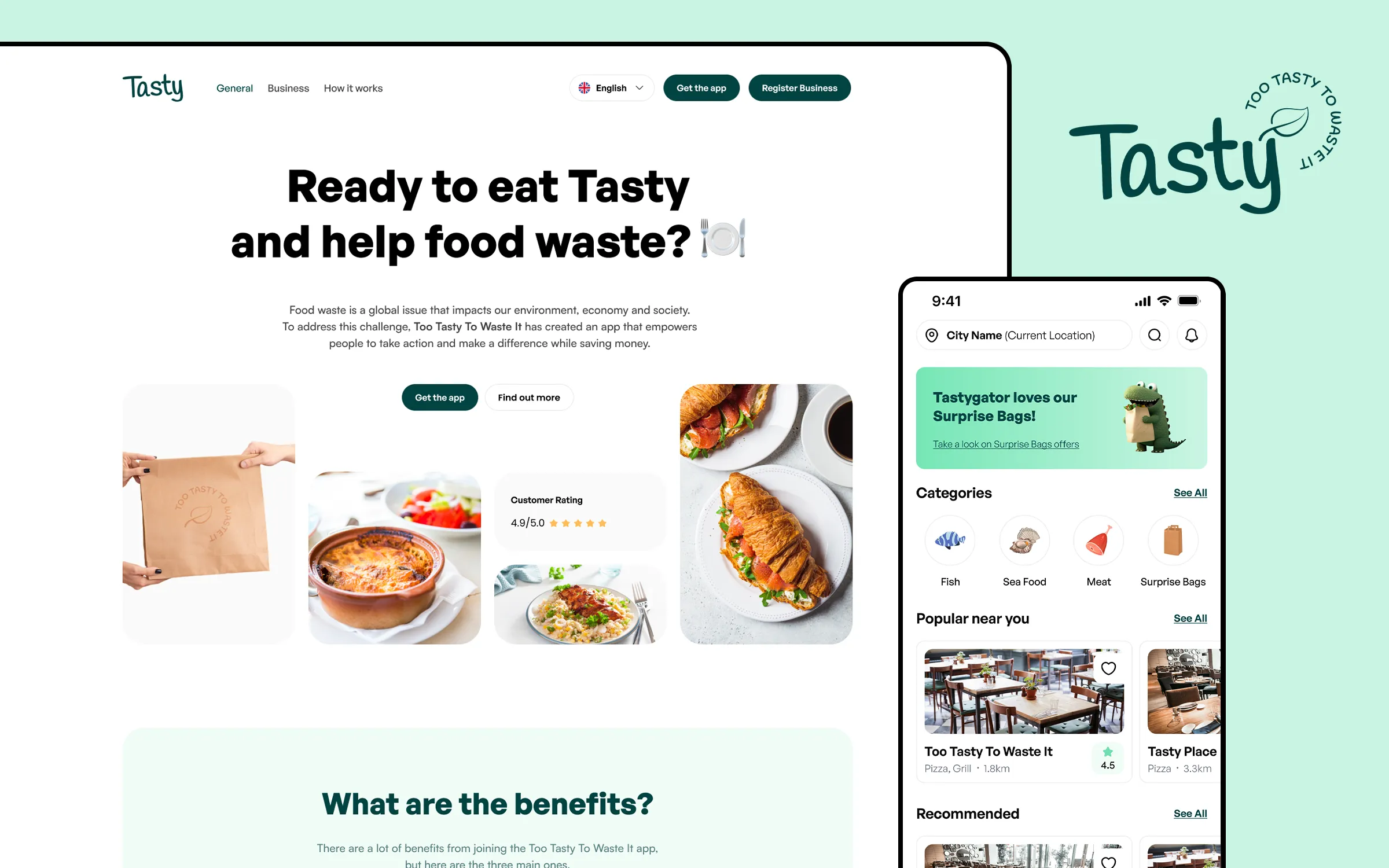
For Tasty we connected every part of the brand: the visual identity, the Tastygator, the mobile app, the web platform, the landing page and social media communication.
A big problem that could not feel heavy.
Tasty connects users with restaurants, bakeries and shops that can offer surplus fresh food at a lower price instead of throwing it away.
A product like this has to explain a serious topic without preaching. It needed to feel approachable to someone looking for a good deal, yet serious enough for business partners who see it as a new sales channel.
Visual identity
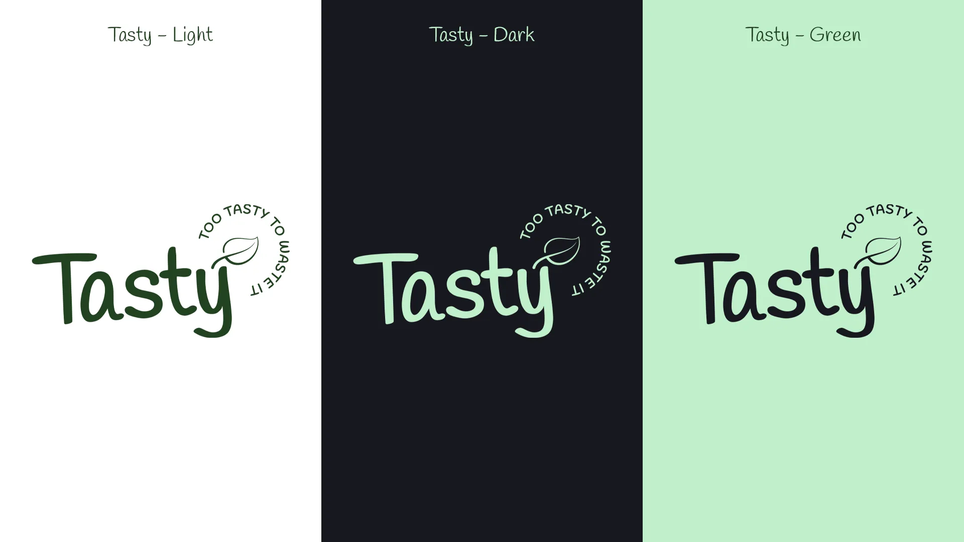
One idea, recognisable in every variant.
The handwritten logo gives the brand a human character, while the circular “Too Tasty To Waste It” signature and the leaf sum up the whole idea. Light, dark and green variants make the system flexible enough for the app, the web and campaigns.
Brand character
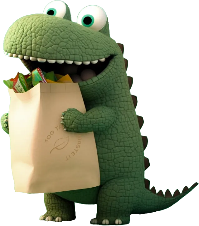
The character that makes Tasty recognisable.
The Tastygator makes the serious topic of saving food more approachable. The illustration with the bag became the main motif of the offer and the brand’s communication.
Mobile app
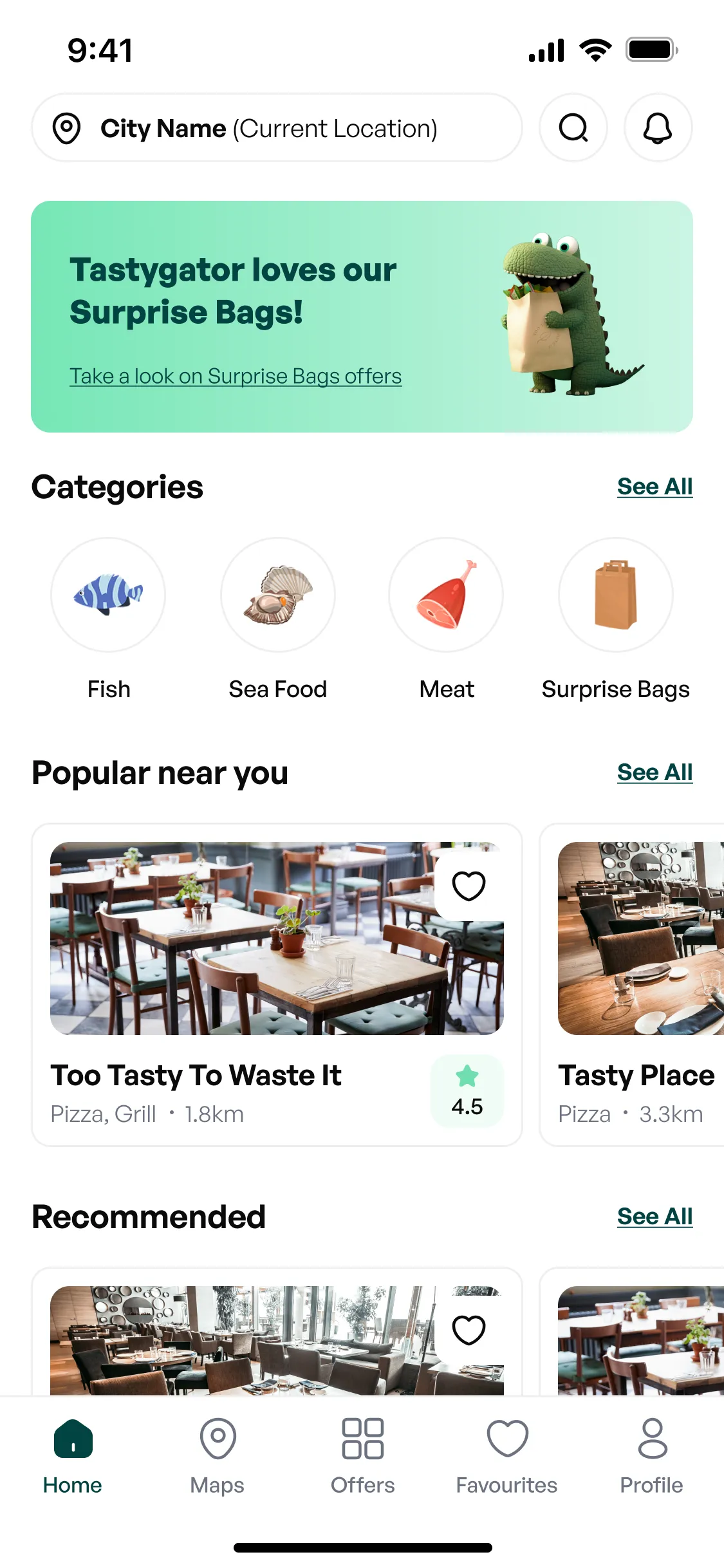
From nearby deals to an order, no detours.
The app answers four simple questions: what is available, where it is, what the offer includes and how to pick it up. That is why price, distance and offer status come before secondary details.
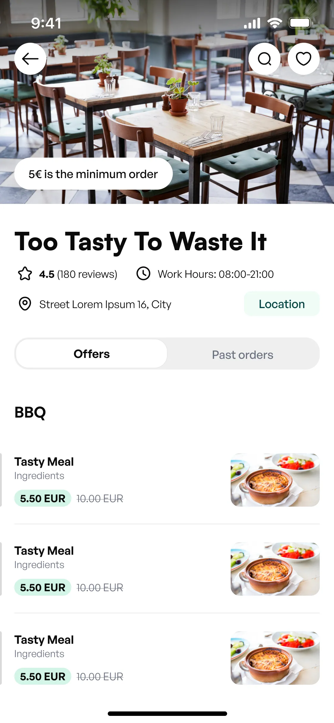
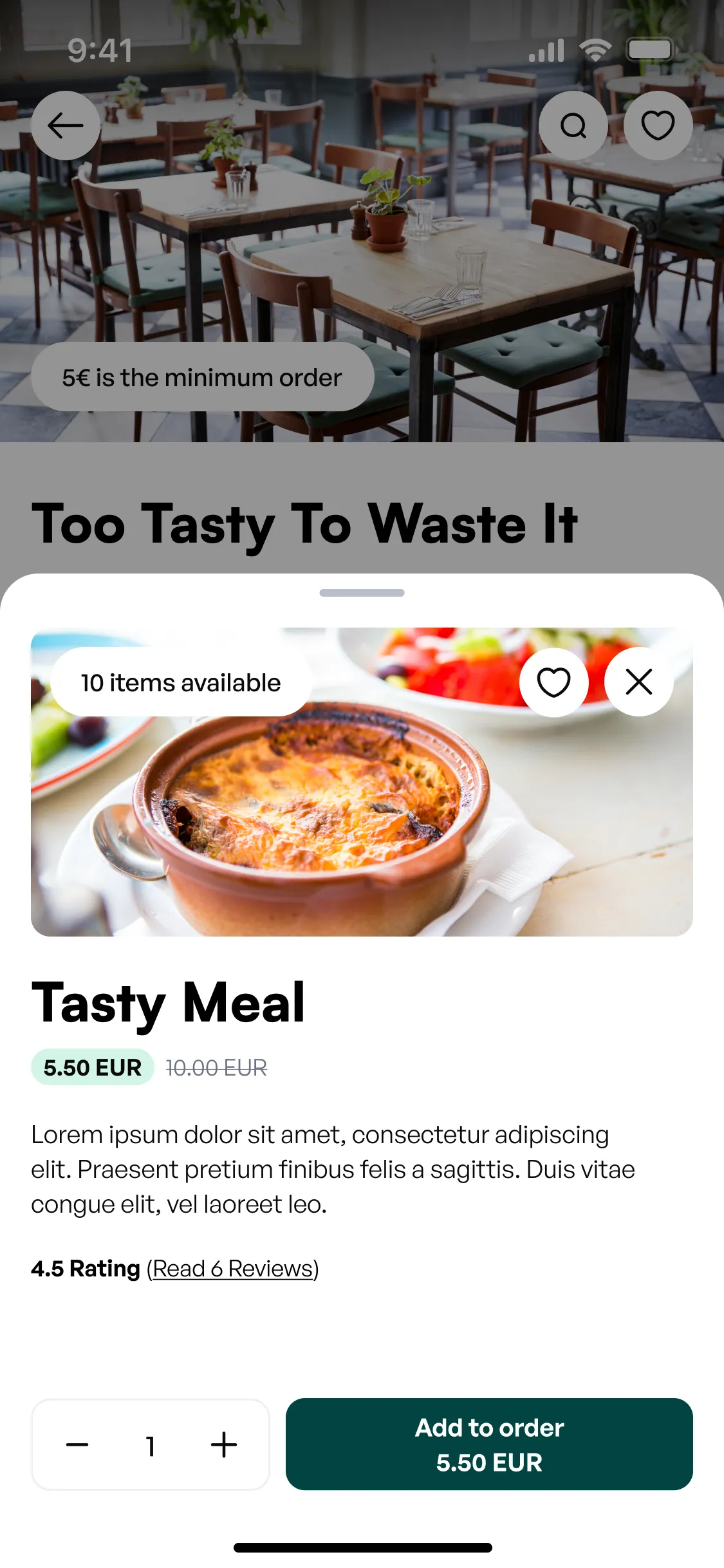
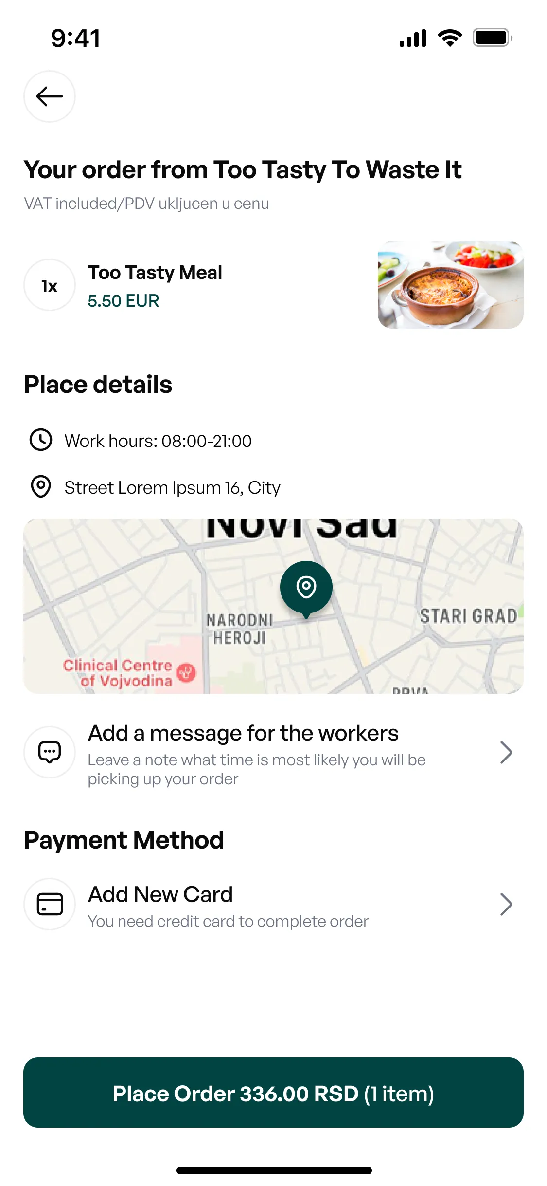
Swipe or tap to browse 1 of 4
Connected system
One product, shaped for different moments.
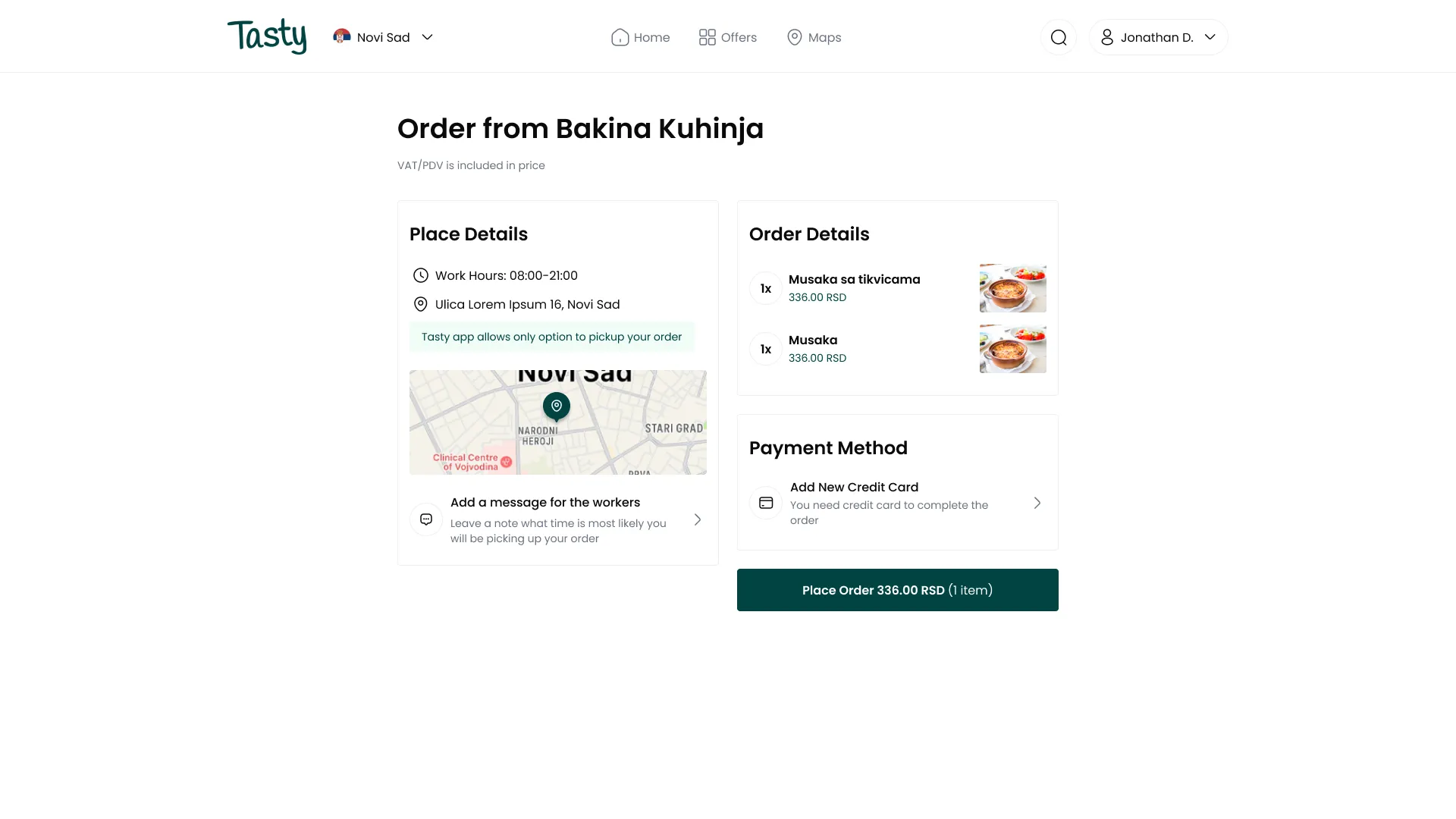
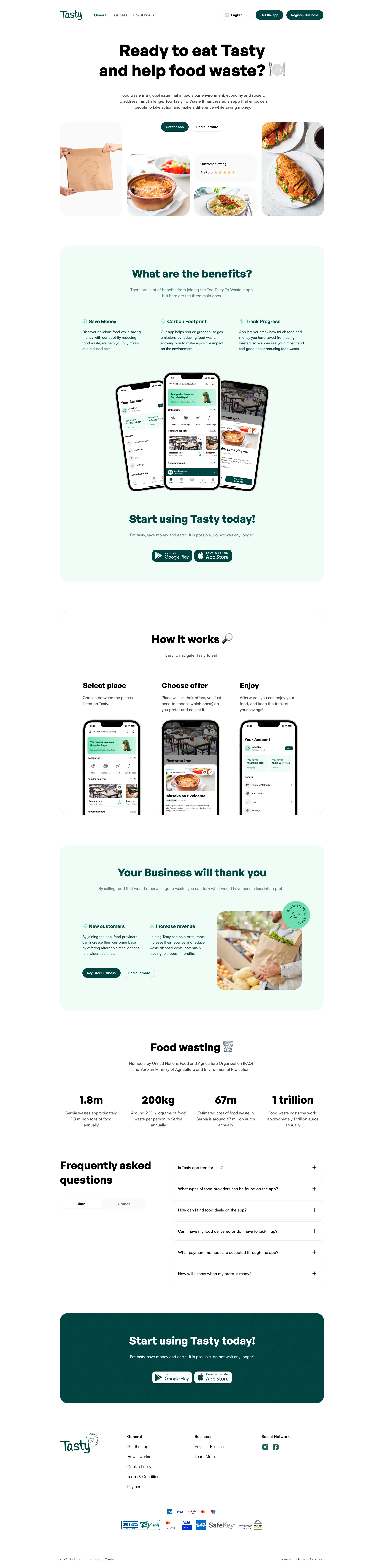
The mobile app is made for use on the go. The web app gives a wider view of the offers, and the landing page explains the benefits to customers and business partners. Every part uses the same language, colours and content layout.
Offers, categories and partners in a wider desktop view.
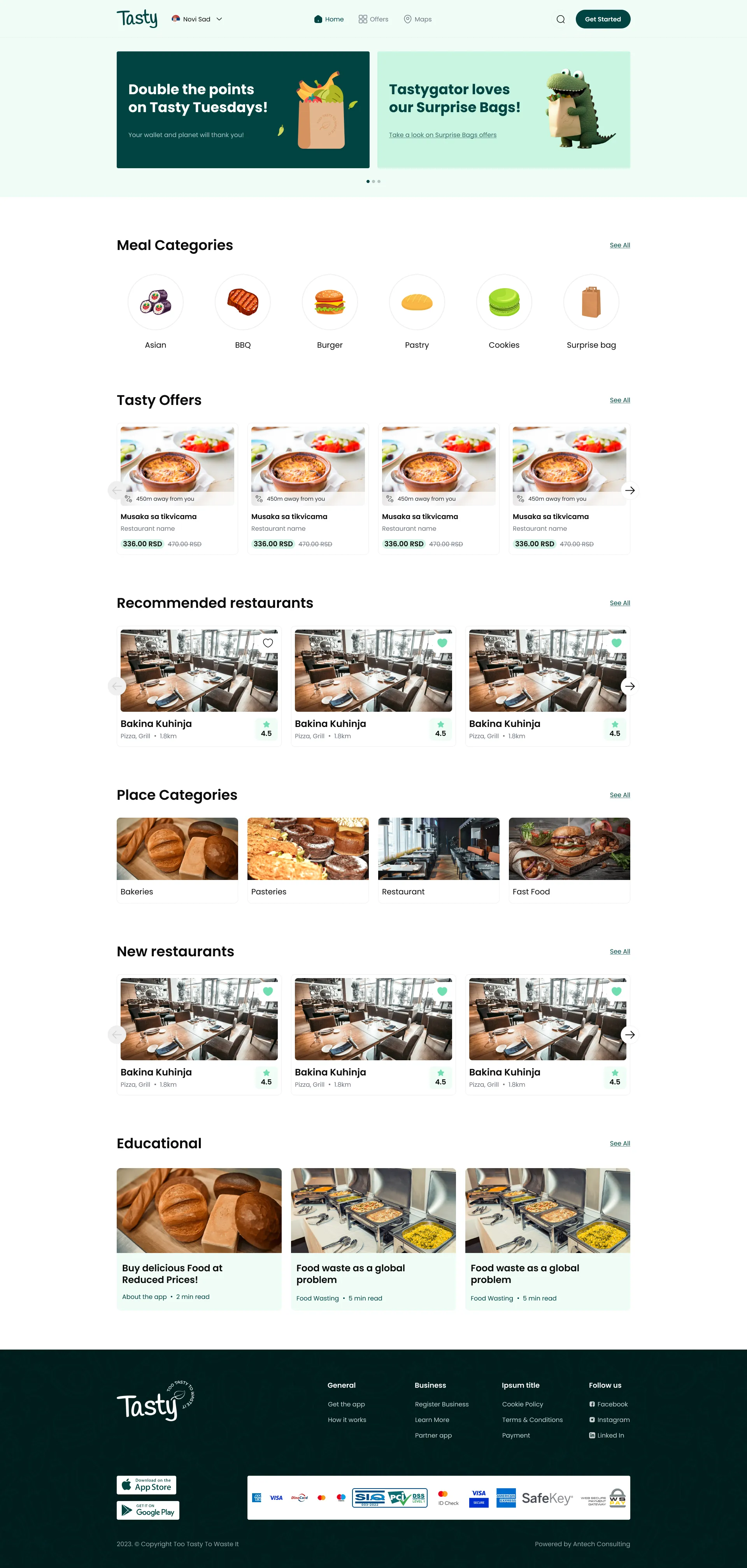
The desktop steps are designed as part of the same product, not as a separate form.
One version explains the benefits to customers, the other invites business partners.
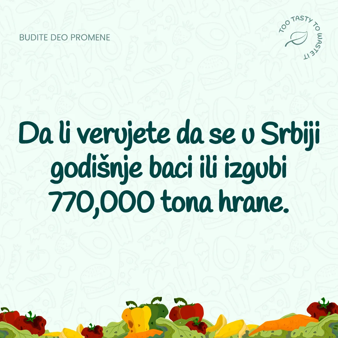
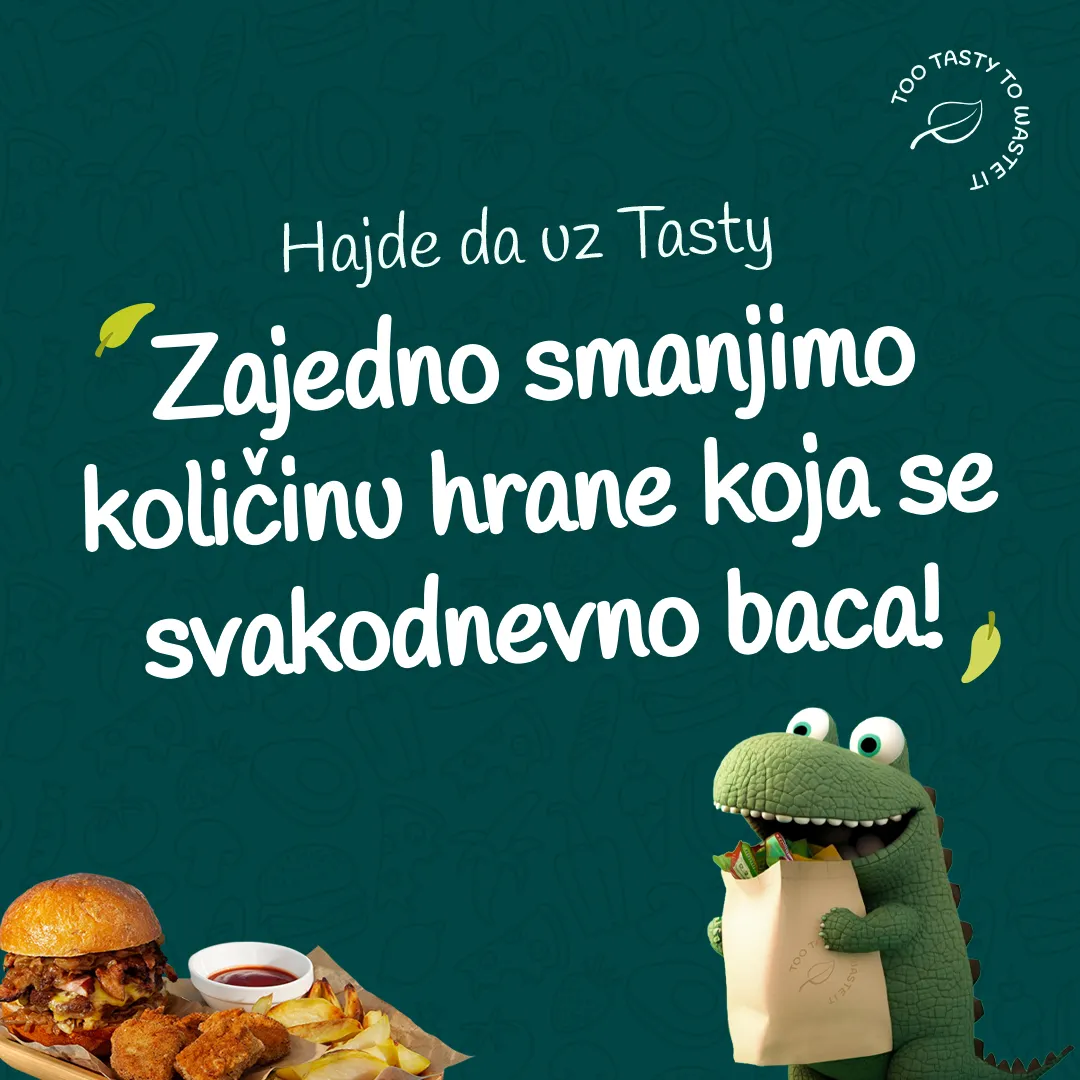
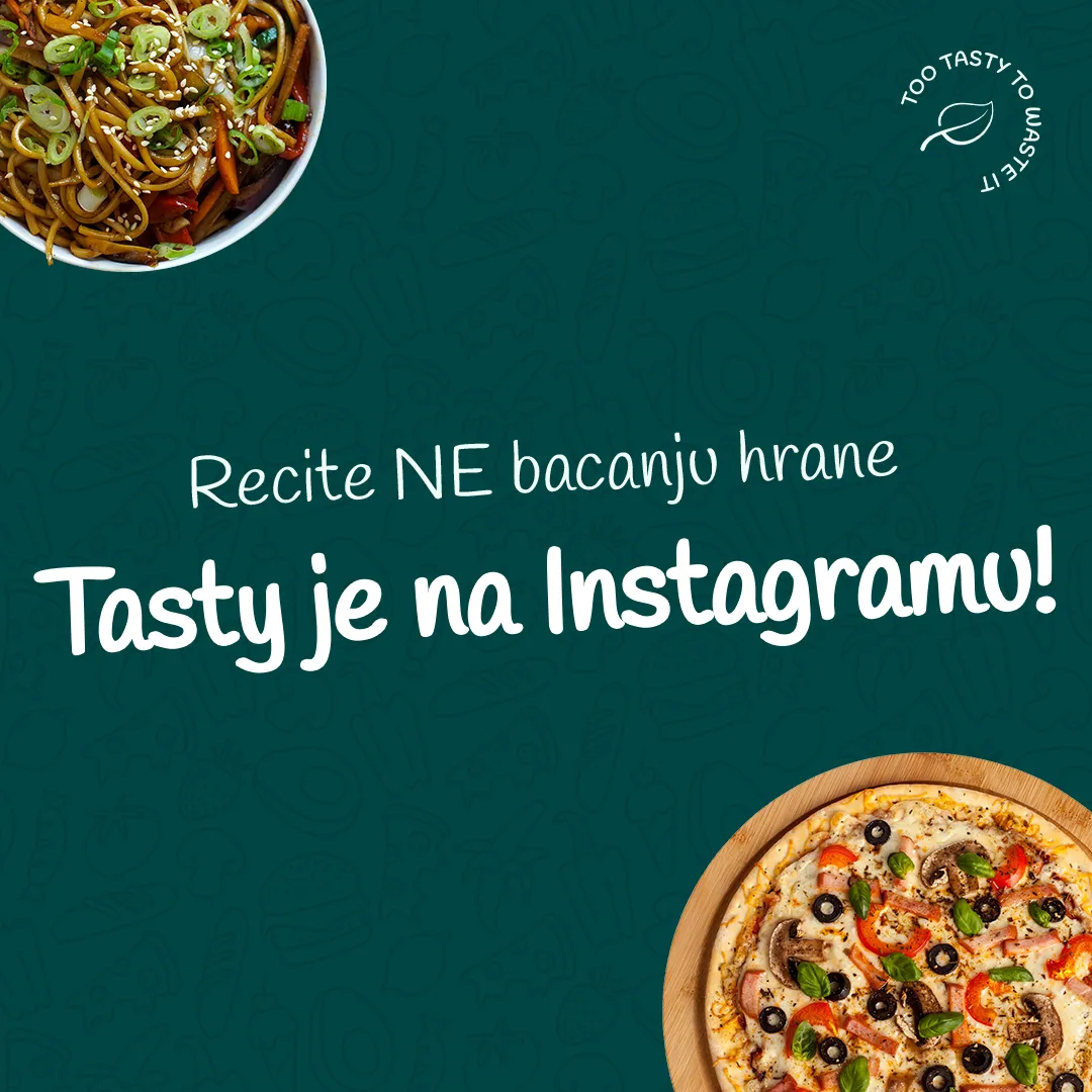
Swipe or tap to browse 1 of 3
In the client’s words
“What can I say? After a great first experience we hired them again for a new project that covered the full package of design services - from branding to mobile and web apps, landing pages and more - and they nailed all of it. They remain our first choice for every future project.”
Result
The brand got a character. The product got one voice.
Tasty got a visual system that can explain the problem of food waste, present the offer and guide users through the digital product without changing its tone.
The identity, the Tastygator, the mobile app, the web platform and the communication materials were designed as one connected whole.
Identitylogo, colours, typography and pattern
Digital productmobile and web app
Communicationlanding page, social media and the Tastygator
Project
- Visual identity and logo
- DuoDots
- Mobile and web app UX/UI
- DuoDots
- Landing page
- DuoDots
- Tastygator - visual direction and applications
- DuoDots
- Graphic and communication materials
- DuoDots
Have an idea for a digital product?