Clear mark
Legible in the header, icons and communication details.

Branding · UX/UI · web design
For Antech Consulting we designed the logo, visual identity and website UX/UI that present a complex technical offer clearly and openly, without the generic corporate feel.
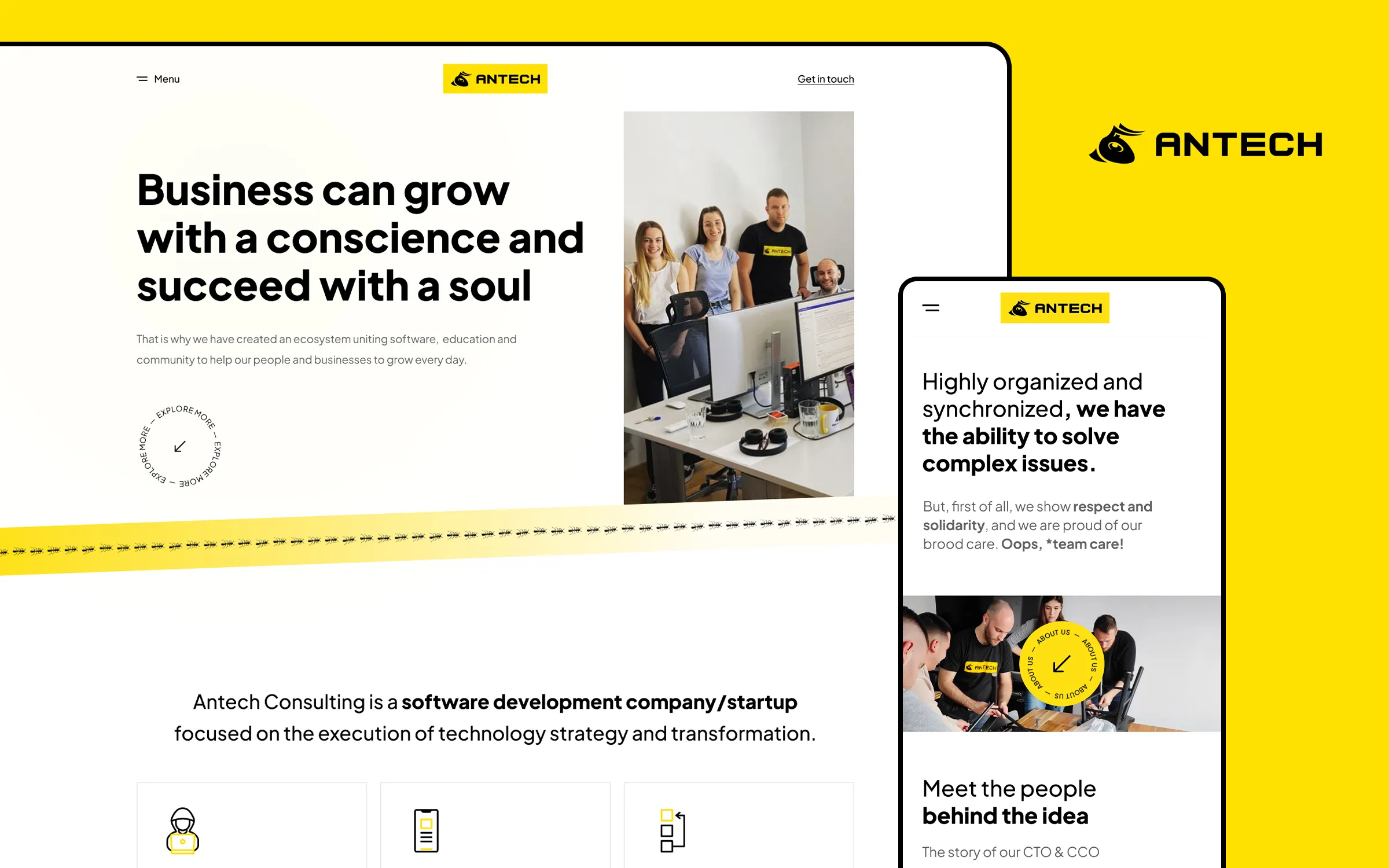
Antech Consulting is a software company focused on building digital solutions and delivering technology strategy. So the website could not just list services; it had to show the people, the way they work and the values behind the expertise.
An initial functional direction provided the content base. Our job was to build a recognisable identity and an information hierarchy that speaks to potential clients, partners and future team members at the same time.
Visual identity
A distinctive mark, strong typography and yellow as a functional accent give Antech its own rhythm. The identity works as a full logo, a standalone symbol and a small navigation detail - without losing recognition.

Legible in the header, icons and communication details.
Black and white carry the content, yellow marks the key action.
Team photography and direct language replace cold tech clichés.
Finding the direction
The early direction was darker and closer to other tech brands. The final design kept the black and yellow, but added more space, clearer headlines and real people at the centre of the story.

Early directionA darker approach with the basic content structure.
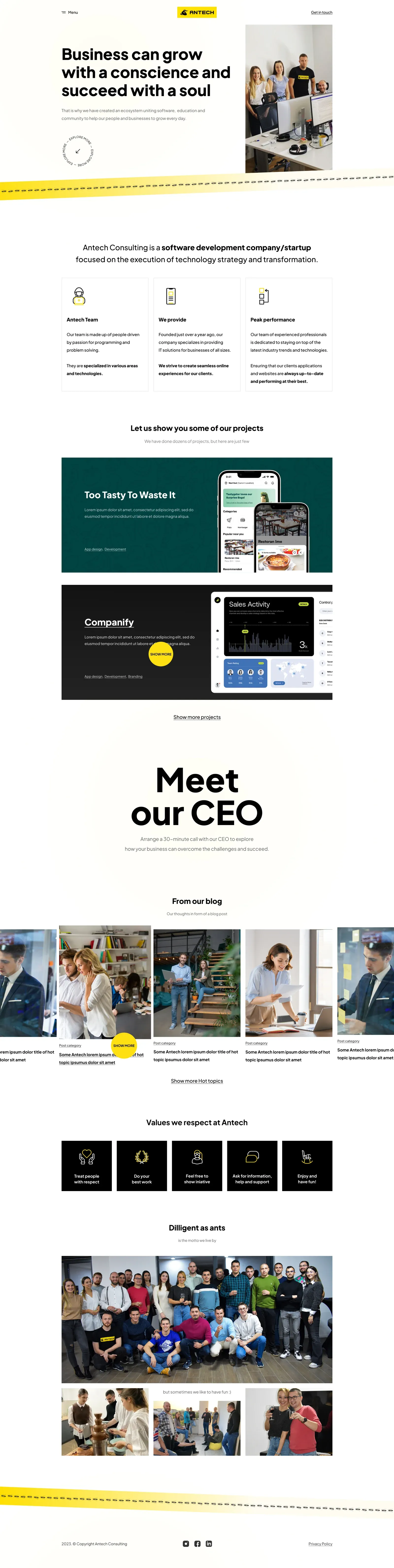
Final designMore space, real photography and clearer actions.
Desktop experience
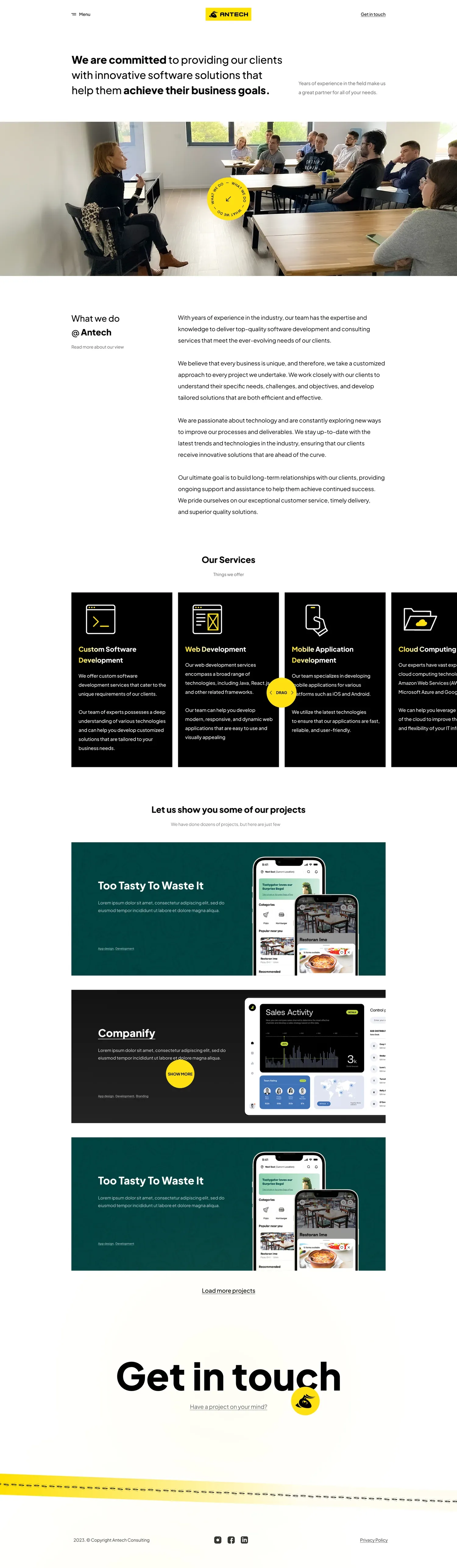
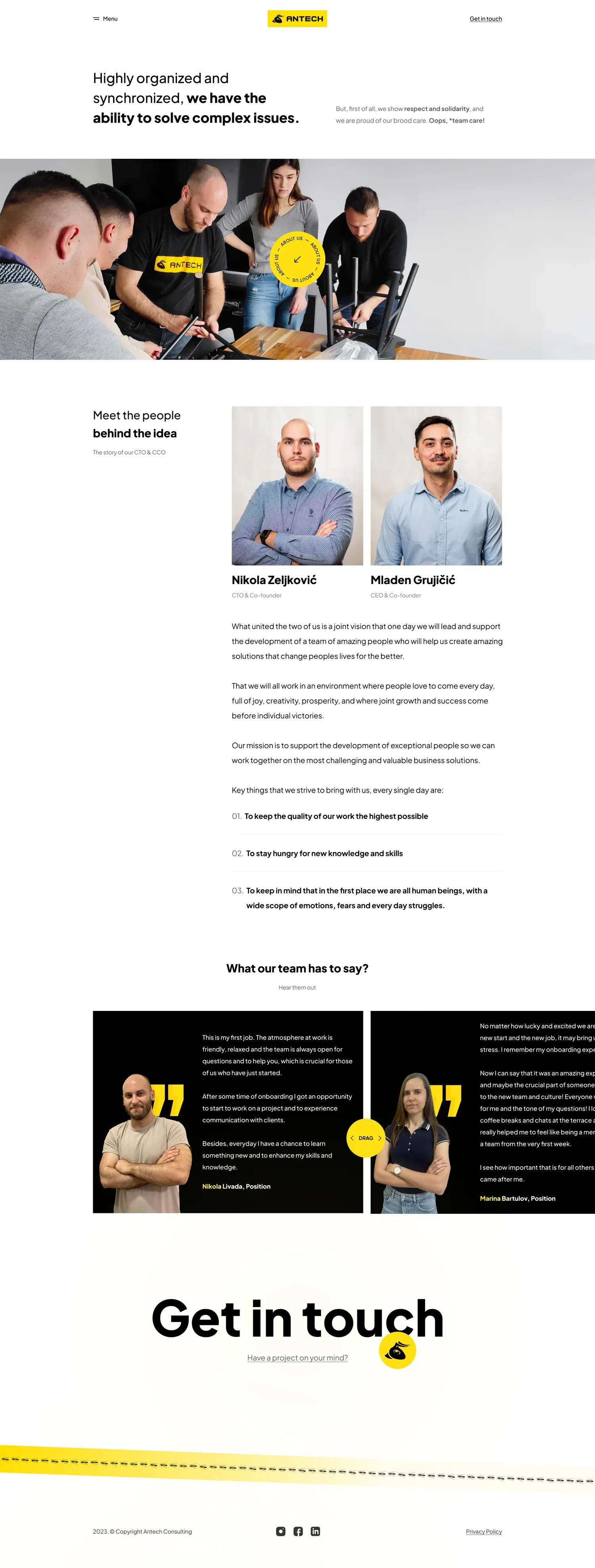
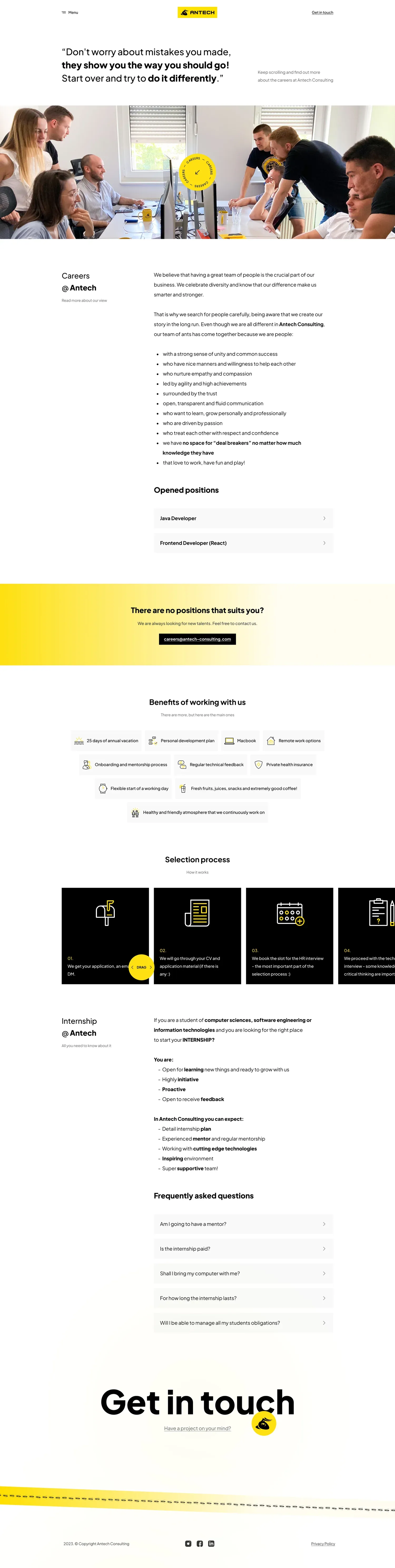
The home page builds trust, the services page explains the offer, “Who we are” introduces the people and careers speaks to future colleagues. Each page has its own focus, but uses the same logic for spacing, typography and interactions.
From positioning and projects to values and an invitation to talk.
Designed for every screen
Long pages were reorganised for thumb reading: content comes in shorter chunks, cards become a natural sequence and key messages stay visible without relying on the desktop layout.




In the client’s words
“We really liked their approach. Communication was easy, they listened carefully to our ideas and came back with solutions that did not just include them, but shaped them into a seamless user experience.”
Antech Consulting
Result
Antech got a recognisable mark and a visual system that does not get lost among similar tech companies.
The website design clearly connects the business offer, team culture and hiring, and is ready for desktop and mobile.
Does your expertise deserve a better digital presence?